Fun with record selection in the Power Apps Cards tutorial
I recently tried out the Tutorials for Power Platform (Adaptive) Cards. I was able to run through the 3 published lessons swiftly (though some of the specific instructions needed to be modified. #preview).
I’m pretty stoked at the idea of having adaptive cards designed in Power Platform, which can be used to create low-code experiences as part of in-line chat in Teams channels and chats.
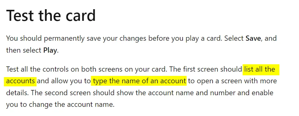
That said, the final tutorial (Cards + Dataverse data) left me underwhelmed, as the end product relies on a user hand-typing in an Account name, perfectly matching what’s on the list. While fine for a tutorial, it’s not something I’d put in front of an end user or customer.

I used this as an opportunity to puzzle through how I could improve upon the interface while using the limited toolset of the card designer.
Below I cover some of my thought process as well as screenshots and a code sample of the path I picked.
A few ideas
Improving upon the interface has several broad approaches. My biggest problem to solve for is the way we’re selecting records, which is too prone to issues. A few ideas that came to mind for the approach are:
- For the repeating list of Account Names, make the row link to the editor card when clicked
- Implement more of a search-style interface, removing the requirement of perfect user input
- Have the account selection happen outside of the Card, either through an interactive chat or automation that pushes a specific pre-selected item to the card
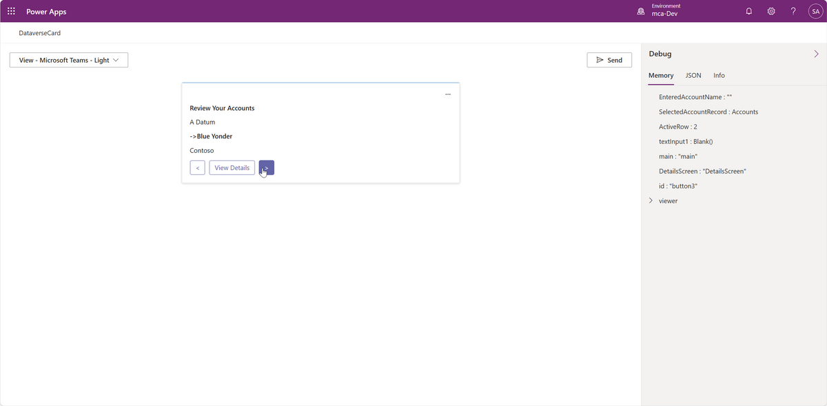
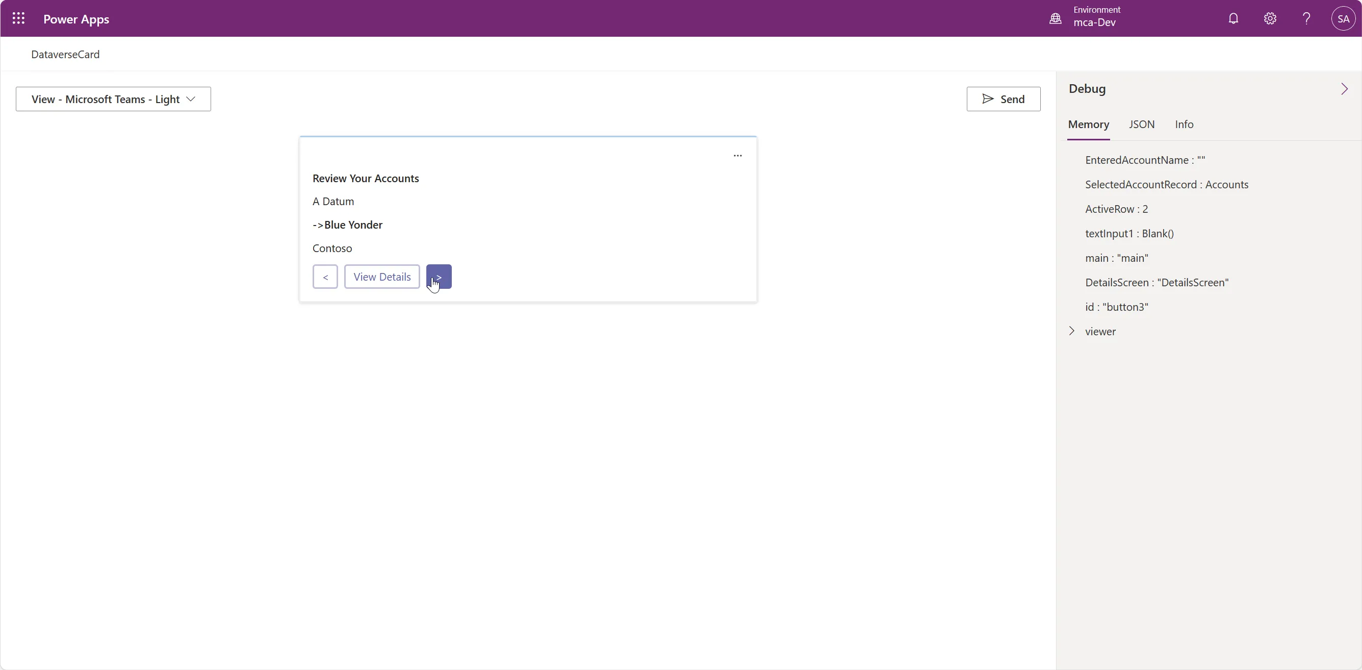
- Implement a visual way to cycle through the repeating list of Account Names
The simplest approach is the first one. I like simple. But also, since this was about exploration, I also wanted to test some of the potential limits of the Cards functionality…so I picked option 4.
Building the solution
The variables in Cards have changed a bit since the publishing of the docs (common when working with preview functionality). Some of this was nice to see (expanded variable types), but some was frustrating (setting a default variable for the record was not being friendly, so I couldn’t use a variable for the selected record).
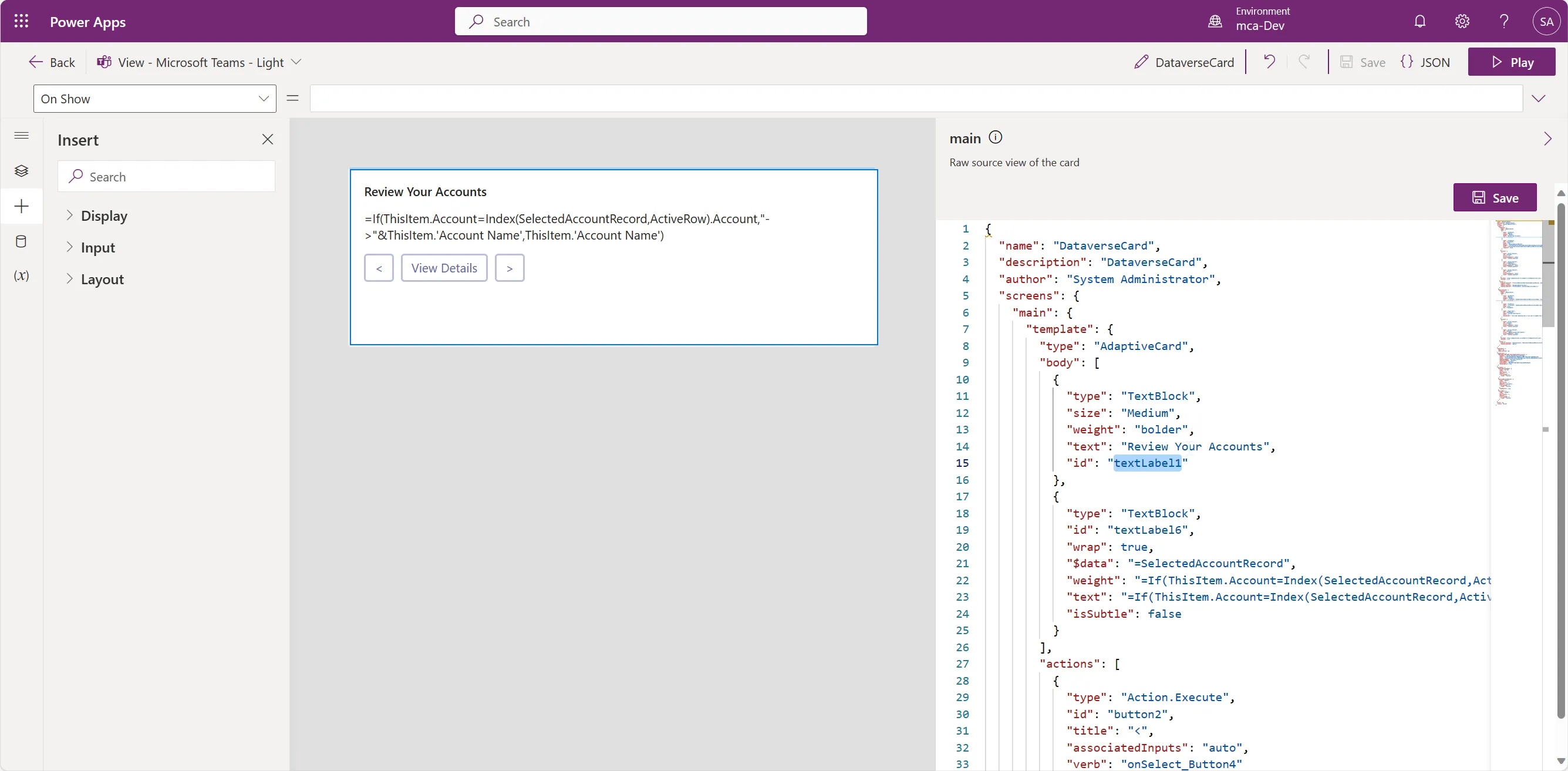
To work around the latter portion, I leveraged the new-ish (to Power FX) Index command. I’ve used that one in Excel for well over a decade, and it’s a welcome friend to Power FX.
The approach I took was to use a Collection variable, plus an Integer variable to track one specific item that the user is “selecting”. I added some arrow buttons to increase/decrease the index, then added some additional formatting to the selected item. The effect makes it clear which record you’re looking at.

Some source
If you’re interested in seeing the editor view of the selector screen, you can take a gander here.

Also, the full card JSON definition for both screens, here ya go.
[
power-platform-snippets/cards.md at main · mathyousee/power-platform-snippets
A collection of snippets and samples related to the Power Platform. - power-platform-snippets/cards.md at main · mathyousee/power-platform-snippets
![]() mathyousee
mathyousee
](https://github.com/mathyousee/power-platform-snippets/blob/main/cards.md?ref=matthewcanderson.com)
I really appreciate having direct access to the JSON that I’m editing in the friendly editor.
Conclusion
The Cards capability in Power Platform is still in preview. Based on my experience in the editor and working with variables and Power Fx, this is what I’d consider more of an early public preview. I was working around too many things for it to make me more productive.
Still, I’m excited with this lightweight visual interface. Adaptive Cards are really cool (separate from Power Platform) but they’re a bit of a hassle to work with. While the tooling around this is improving, Adaptive Cards + Power Platform is enticing. Specifically, the data connections of Power Platform, plus the programming capabilities of Power Fx, all wiithin a single card designer.
I’ll be keeping my eyes on this one as it matures.